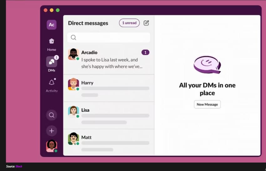
Slack is getting new DM redesign for its collaboration app. The interface changes also makes sees other features on the messaging app, making it look more like its rival, Microsoft Teams.
The focus with the upcoming Slack redesign is to allow faster navigation between channels and conversations, increased emphasis on tasks, and quick access to tools to further boost productivity.
You’ll be able to access all your channels, direct messages, and other apps from a unified Home view, which acts as a base of operations.
Slack says that it should feel similar to its existing interface, but it arguably seems more like Microsoft Teams than ever before if you take a gander at the headline image of this article or the image below this paragraph.
An additional benefit that Slack has highlighted is specific to customers of Enterprise Grid who are a part of multiple workspaces.
They no longer need to switch through workspaces to navigate across channels as all of their channels will be available directly in the Home view.
Another major design change is dedicated views that facilitate uninterrupted workflows.
For example, the Activity view gives you a bird’s-eye view of, well, online activity around you, especially items that are relevant to you.
ALSO READ: 12 Reasons You’re Getting Poor Tweet Engagements
Meanwhile, Direct Messages lists your unread messages, Later can be leveraged to save messages and action items that you intend to return to at some later point in time, and More is where you’ll get quick access to canvas, workflows, and other apps.
Slack has emphasized that these views should give you more control over your workflows, along with offering granular notifications so that you can prioritize and balance between heads-down time versus online collaboration and communication.
Slack is also encouraging its customers to use the tools and utilities present in the app.
It is shining a light on some of them by offering a new Create button that enables users to start typing a new message, build a canvas, initiate a huddle, and create a new channel.
The idea is to enable Slack users to take advantage of all the capabilities that they had access to before, but with fewer clicks.
The app aims to be your one-stop shop for initiating discussions, managing tasks, sharing audio and video content, and more.
Lastly, the Search functionality is being updated too. Users can now click on search results to see the full context for an item rather than clicking on it, having it open separately, learning that it’s not what they were looking for, and then navigating back to look at some other result, potentially repeating the same cycle multiple times.
Slack has touted its unwavering commitment to its application, saying that it has made over 100 changes to the software in the past 12 months alone.
The new redesign will be rolling out to new teams who sign up for Slack starting today, while it will become available to existing customers within the next few months.
The company likely wants to trial its major changes with new users, gather feedback, and make modifications accordingly before making somewhat drastic changes to the workflows and environments of its current customers.


 and then