After eight years of its existing logo, Chrome decides to be changing its logo.
In an announcement post on Twitter, the platform says that the logo will be available to users soon.
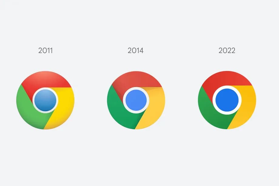
Although not visibly noticeable, the new icon is different from the existing one and others.
You might need to squint a bit to see the difference.
Elvin, the designer, shares the picture of the new development on the announcement post.
The new icon is now simplified, removing the shadows on the borders between each colour.
Also, the icon carrying red, yellow and green are now in a flat form.
And while the blue circle in their middle, outlined with a white, is more visible.
Elvin says in the post that it is ‘redefining the proportions and brightening the colours’.
This development is for the brand logo to align with the modernise expression of the Google brand.
Also, the designer noticed that the colours shades of the brand caused an unpleasant vibration, therefore, introducing the more subtle gradients.
This would result in the icon looking less serious and more accessible to people.
READ ALSO: Twitter Makes Access To Downvote Replies Worldwide
Although this doesn’t apply to all windows with the Chrome app, the Chrome app comes with the Chrome logo.
Chrome wants the icon to be recognisable on each of the OS available.
Hence, it creates OS-specific customization.
This would give the different OSs a customised look.
An example is Windows 10 and 11 versions.
The colour comes in a more dramatic way than other forms, but it fits into the style 0f the Window.
The logo looks more colourful for ChromeOS, with brighter colours, complementing all other icons on the system.
While for MacOS, the logo would come with a little shadow, making it pop out.
Although Elvin has said the platform decided to roll out the new icon to all users, it would start with those using the Chrome Canary.
And then later extend to everyone in months from now.
Implications
As a user, what you will gain from the new development is a change in the icon.
Chrome idea of the new icon is to make its brand look more accessible and simpler on the surface.
And this is evident in the previous changes it had done in years past.
It started from a three dimensional that came in its form of modernity that had existed then.
However, as the world evolves, it also needs to be involved in its development.
Hence, the colours are becoming simpler and simpler.







 and then